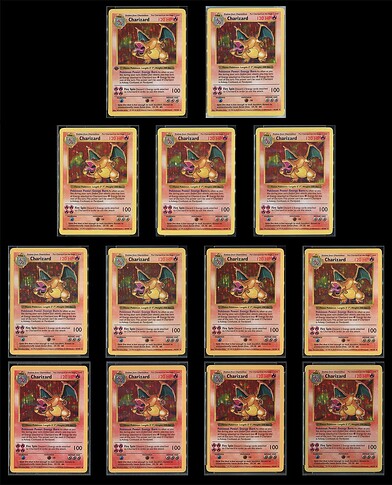
Let’s get into the weeds here. Yes, lighting and background reflections can be tricky. That plus the white balance and the camera used make for a tough call. That said I believe that one is from the same block of sheets or at least is most similar to the first two below. The red of the HP is very vibrant looking, probably because it’s in contrast to the background of the card template which has a more pinkish red to it relative to most variants. The border is closest to the more yellow ones and the holo background will be a bit closer to a true red versus the typical red-orange.
