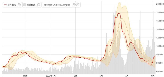
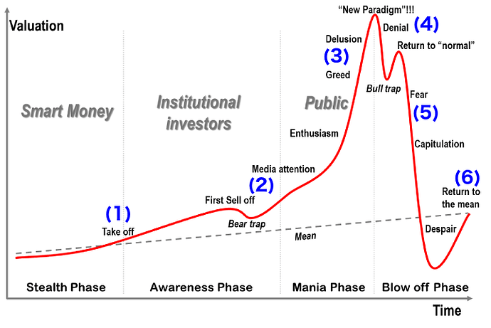
Interesting chart comparison:
This was from a popular Japanese site for tracking card prices. The chart shows an index over the past year of sold prices of PSA 10 slabs of top-pricing cards from each set released during the SM to SV era.
And this is a sample chart used to demonstrate the typical lifecycle of a bubble when teaching Economics.

