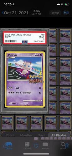
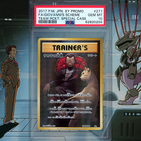
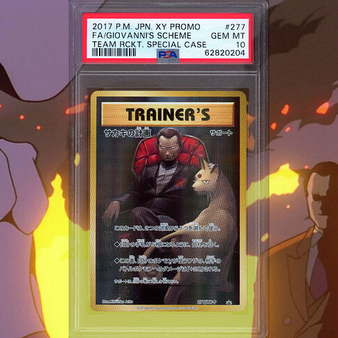
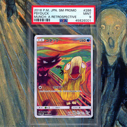
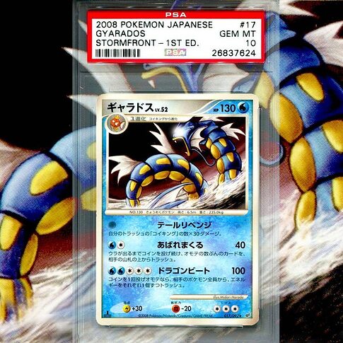
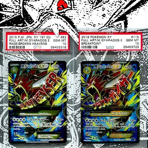
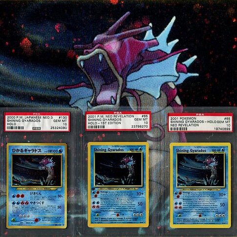
I’m always confused about when and where to take photos of my cards to show them off the best. Sometimes when I’m ready to take the photo the sun is behind clouds, or the sun is on the other side from my window and all I have to work with is ambient lighting. And when I use a room light my camera and body always cast a shadow on the card.
So this post is just showing off different lighting conditions with a few notes and whether I like it or not. I will recommend or not recommend each method for whether you should use it on your own posts or not.
I hope you enjoy and find this useful!
If there is any interest I would be keen to post other cards/rarities in these same conditions for comparison.
HQ Scan. Good for uniformity and showing condition but not very colourful. Recommended as it is a good neutral way to show off your cards. But the presentation is a bit dull with a pure white background.

Inside with ambient outside lighting from the top. Does not show very much detail. Not recommended as it shows none of the natural beauty of the card and you dont get a very good image of the artwork either.

Inside with ambient light with back facing the light. As you can imagine this has even less detail as less light is exposing it. Not recommended as the card is backlit and this does not show the card very well to the audience.

Outside in full sunlight. This shows well the texturing and colours of the holo pattern but the artwork becomes obscure. Recommended as it is the best way to show the holo pattern, however, try to take a photo with the artwork still visible.

Outside in sunlight angled down. Excellent for showing the artwork and shows a bit of texturing and colour. Recommended as it shows the artwork and artwork is not neutralised by excess light.

Outside back to sun. Similar to the ambient light with back facing light, this does not show much detail. There is more light exposing it than inside so a small amount of texture is seen and the artwork is still visible. Recommended as it does the job of showing the cards artwork.

Outside Overcast. Very neutral. No exaggerated holo pattern or texture and artwork not obscured. This is slightly nicer than the scanned image as it has some variance in lighting, which can be more pleasant than being uniformly lit. Recommended for a nice clean neutral photo.

Flash on (lights on or off). These next ones are a bit excessive but I found the results interesting. The flash shows the texturing and a bit of glitter/holo pattern well but parts of the card are darkened. First photo was angled and so has a large white spot in the corner, which completely obscures that part of the artwork. Second photo is directly above and so the spot is neutralised and the light floods a larger area of the holo pattern. Recommended only for showing your cards in an excessive fancy way when you are not focused on showing too much artwork and want the holo pattern to show.


Most recommended:
Outside Full Sun or Outisde Overcast are both fine. Always outside as it produces the best neutral lighting without any bias in colour like most inside lights have. Outside also is easier to avoid your shadow being cast on the card. The biggest problem you will face is having a uniform background such as a white background as you will need to find a place to rest the card that is also lit by sunlight. If you have studio lights then this would be the best practice, however this post is for when you do not have photography equipment.
Thanks for making it to the end
