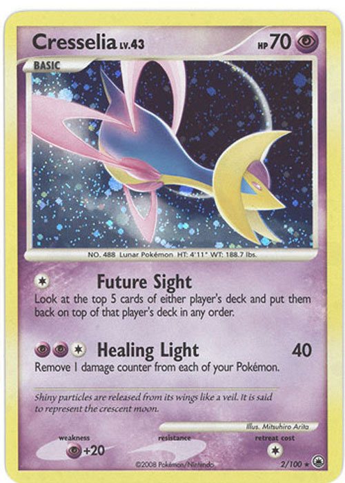
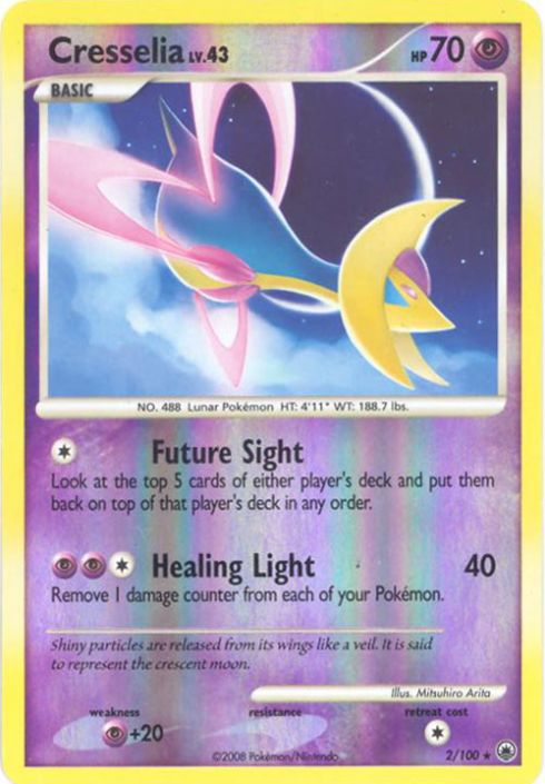
There are some cards that I love due to how stunning/beautiful/detailed/etc. the background of the artwork is. If that card is a holo rare, sometimes I feel like the holofoil takes away from the beauty of the card itself (Not always, but definitely sometimes). Here are a few instances that I think the nonholo variant of the card looks better than the holo:
Expedition Mew. Such a beautiful card. I really like how in the nonholo variant, the wildflowers look so similar to Mew, wild yet beautiful.
Holo version? Mew is just kind of floating there, and you can’t tell what the background is.
Aquapolis Umbreon. One of my favorite artworks for one of my favorite Pokemon. I mean look at how much detail is in the background. This late night city really reminds me of 90’s anime. I’ve talked about this card in the artwork thread… simply one of Arita’s best works!
The holo version? Can’t really see the background at all, and in my opinion, takes away from the incredible details in the background.
Obviously these screencaps aren’t the best representation of holo cards, and I think that there are definitely arguments to be made FOR liking the holo variant of these cards better. But, I would love to hear about what you guys think, and which cards you prefer the nonholo variant for rather than the holo variant!
Thanks for listening to me ramble!
#spicytake Base Set Blastoise. Maybe a technicality since it’s not really a set card, but the blue and green background hits me right in the nostalgia for some reason. I think maybe it was non-holo on the Play It! V2 CD? Or it might just have looked that way in a magazine or something… I definitely didn’t own a Trainer Deck Blastoise
Most modern Japanese promos. I think modern art they create for cards is so good that a holo treatment isn’t needed, and in some cases the holo they use can actually cover up the artwork or colour the illustrator worked hard to perfect.
I’m not sure if I believe anyone in this thread. I think we’d all be okay-ish with non-holo counterparts to holo cards, but would anyone ACTUALLY only want a non-holo instead?
Or maybe it’s just me and I’m just a crow who likes his shinies.
Some great examples so far. When there are a lot of subtle nuances in the background, it usually doesn’t translate well into the holo version.
This one come to mind for me. Truthfully not that great as holo, but really beautiful and expressive once you see the colorful sky.
On the other end of the spectrum, the best holo cards are those that incorporate the holo effect as an essential part of the artwork; where you know the composition just wouldn’t work without the holo effect.
(Easily one of the best holo cards ever, fight me if you dare)
It’s been a funny ever since every card shown looks great and individualistic as both.
[EDIT] JR Rally Eevee Promo is my answer although same rules apply. That piece akin to Genesis Lugia’s concept shortly after ties Himeno’s previous extensions into a core knot.
A lot of Sword & Shield era holofoils do look great in the new holofoil type with vertical lines, but with some the non-holo artwork still looks better in order to see the nice details. I’ve also checked the Black & White era holofoils with horizontal lines, but most of those have generic backgrounds that fit pretty well with that type of holofoil, and wouldn’t look as good as non-holos imo.


 such good art invisible by the sparkles :c