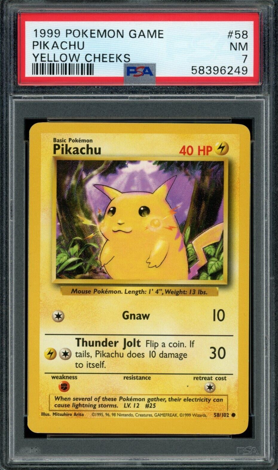
I have read, that there is a colour difference between Base and Base 2 print.
I am curious what the difference looks like. If anyone has a few identical cards from Base and Base 2 set, could you please take a picture of the matching cards next to each other for comparison?
It would be interesting to see an example of each colour (for example a zard for red, green for venusaur etc…)
Its definitely more washed out. I remember opening a base 2000 box back in the day and pikachu was noticeably more white. Here are just a couple quick images:
HI guys! Thanks for the replies. That’s interesting!
I wonder how big the difference is in reality when comparing the cards directly with each other. The linked images from pokecollector seem to be derived from different scans. Therefore, visible colour differences could also be caused by different hardware/ exposure etc.
It is also hard to compare scans from grading companies. There can always be differences in exposure, other settings and hardware when comparing scans from different submission batches, and there are even noticeable differences between scans from one submission batch. You can notice those technical-related differences especially when comparing the colour of the cases from different scans. If the colours of the slab cases from two different scans are very different in saturation / vibrance / hue, then the scan settings also affect the colour of the cards and make a comparison very difficult.
Unfortunately, it is really hard to find pictures showing both base set and base 2 set cards on a single image for comparison.
Here is an example of a direct comparison of base set 3rd and 4th print I found on reddit:
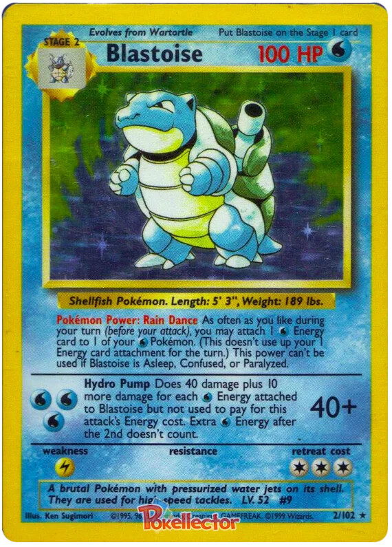
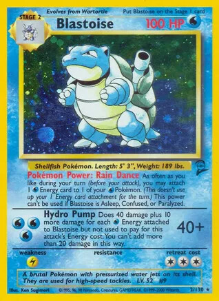
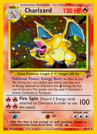
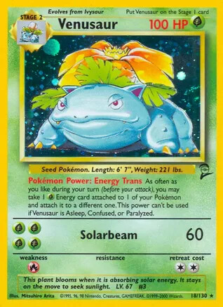
There is definitly a big difference with the 4th print being less saturated.
The only direct comparison between 3rd print base and base 2 set I found are these graded charizards. It does not seem like there is a big difference. But the difference might be hidden through the reflections of the case:
If any of you guys have a few copies of base 3rd print and base 2 set cards and would be able to take a picture of a direct comparison, I would be very grateful!
Just for fun, included a couple different variations. Admittedly the lighting in my room and my phone’s camera both suck, so I’ll try to describe how it looks to me.
Shadowless and Japanese - both the darkest artwise to the point of crushing the gradient in the background a bit
4th print and German 1st - both lightest art and rest of the card wise
English UED and Base 2 - see below
Chinese 1st - Art seems to be more saturated than Eng UED and the rest of the layout is distinctly orange
Thank you for your troubles taking the pictures. This is fascinating. In your example, the 3rd print and base 2 look very similar regarding colour saturation. I agree that there is a slight colour shift regarding the art itself
If anyone else has any cards to compare, more examples are always welcome
Hello community. I found a few more pictures online comparing Base 3rd print and Base 2 set. It seems like there is actually a bit of a difference in colour saturation?
If any of you has some better pictures, I would be very grateful! Thanks!