Introduction ✧˖°.
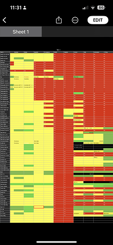
Since updating my all-language, all-variant tracker here: Piplup Line Collection Tracker - Google Sheets, I’ve gotten compliments on it (thank you!), questions about how I did it, and just general curiosity, so I’ve decided to do a write up and how-to tutorial on how I made my collection tracker in Google Sheets. This article is meant to be a step-by-step process on both how I made my tracker and how you can make your own collection tracker in a similar fashion.
In this article, I’ll be covering aesthetically functional formatting, coding cells, and making everything auto-updating when you check off a card.
This guide is meant to be just that- a guide! Feel free to tailor the information here to best fit your collection goals. In addition, I’ll be walking you through some of the basics here as well. My sheet is all-inclusive, and the way I’ve best found to organize my own collection at a glance, but don’t be afraid to get a little creative with it. All in all, take what fits and leave what doesn’t!
Getting Started ✧˖°.
To begin, you’ll need a fresh Google Sheets file. All of the coding I’ll be showing here in this article will be compatible with base Google Sheets without extensions, but there are different (and sometimes less convoluted) ways to code certain parts of what I’ll be showcasing with extensions if you’re familiar with how they work.
Note: Sometimes coding will break or not function as expected if you try to insert or change formulas on the mobile app. I’m not sure why this is, but I’ve found the best way to ensure hassle-free formatting is on desktop. Checking cards off on mobile has been breakage-free for me, however.
In addition to your fresh file. you’ll want a collection goal and a corresponding dataset. Obviously your personal collection goals can and will change over time, but having an idea of what cards you’ll be tracking before making the tracker is always a good idea. The actual information in your dataset will depend on your personal preferences, but as a general guide, I would recommend at minimum knowing the following about each card:
- Set name (and code, if applicable)
- Card name
- Card number
- Finish (non-holo, reverse, etc)
- Languages the card was released in (if applicable)
- Release date (or the the very least, release order)
I’ve also catalogued each illustration for each different printing, but depending on the way you’d like to set up your own sheet, that may or may not apply.
Making a Mock-Up ✧˖°.
So you’ve got your fresh sheet, your data, and you’re raring to go- now what?
We’re going to start by making a mock-up of how our information will be laid out. Depending on what you’re including, the number of columns and such may be different than mine here, but the overall process is the same. Don’t worry about how it looks for now- just arrange the information in a way that makes the most sense to you.
Note: I prefer to separate the Western and Eastern releases in different sheets. This is because my main heading for each section is the set, and Western sets are (mostly) consistent with each other and Eastern sets are (mostly, after the catch-up phase) consistent with each other as well. If you prefer to organize your sections based on something consistent across all languages, like the illustration, for example, separate Eastern and Western sheets may not be necessary.
Changing Cell Size
-
You can change the width of a cell by clicking and dragging the line between the cells at the top of each column.
-
This process also works for height.
-
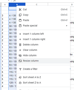
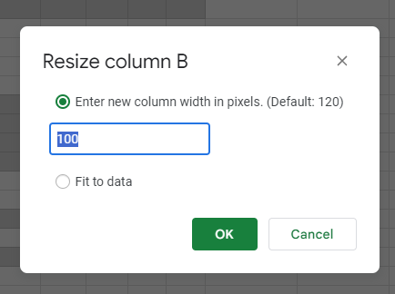
Alternatively, you can make each cell an exact size by right clicking the top of the column (where the letter is) and selecting “resize column”.
-
You’ll then have a pop-up where you can type in the exact width you want in pixels. This will come in handy later if you want columns to be as uniform as possible.
Mockup Examples
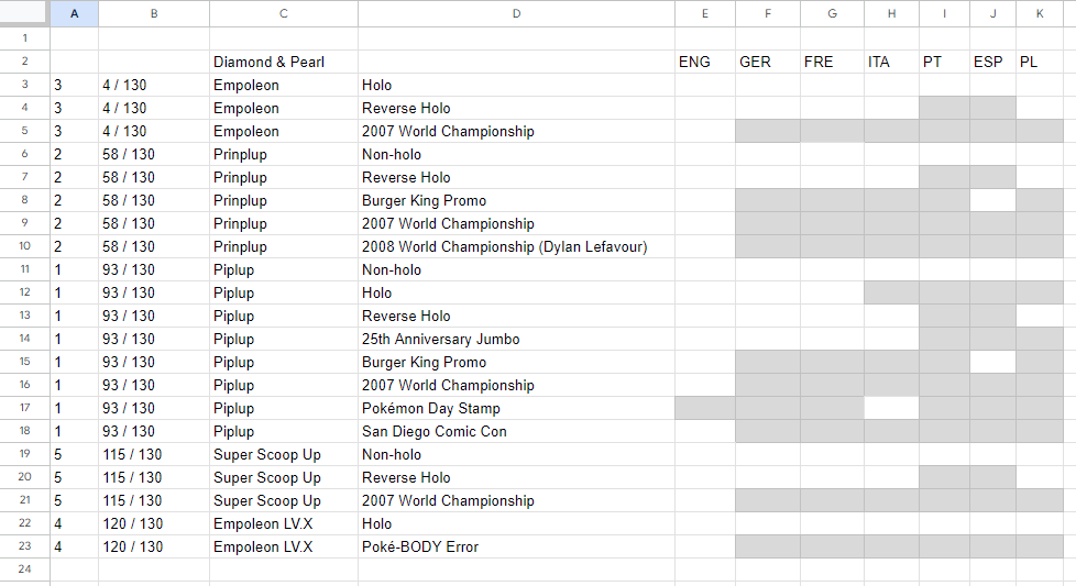
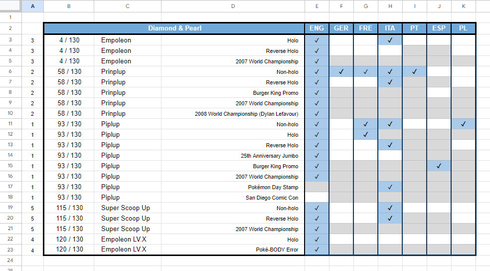
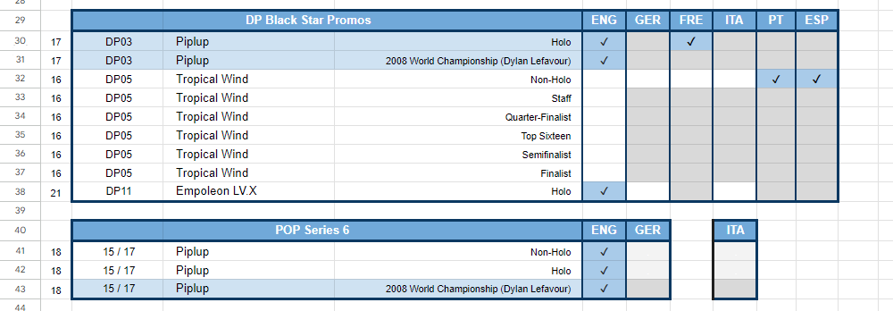
This is what the mockup for my personal sheet looks like- I’m using set organization here:
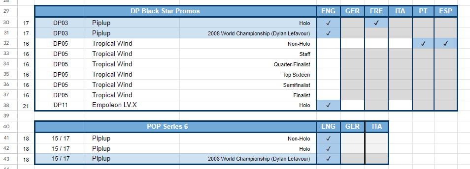
And here is another way to organize that same information, but organizing based on illustration instead. I’ll be going through how to format this option as well as we go through the guide:
Filling in Data ✧˖°.
Once you have your mock-up and are comfortable with the way things are laid out, we’re going to start filling in data- but only for the first section. We don’t want to do the main formatting more than once, so just fill in the first section of data for now. Obviously use your own data, but for simplicity, I’ll be showing my Piplup sheet for these examples.
Note: The way my personal sheet is formatted, I have greyed-out boxes for cards that don’t exist in that combination of variants. You can handle this in a number of different ways, but this is the easiest for me to read for this format, personally.
Dataset Examples
For simplicity I’m only going to be showing my Western sheet for the next few steps, but my personal sheet now looks like this:
Option B from above will now look like this:
The reason we’re filling in only one section of data now, before formatting, is for multiple reasons. First, if you hate the layout, you’ll be able to easily redo it now without having to copy/paste your entire sheet over again. As someone who has overhauled their spreadsheets multiple times over, you really don’t want to do that if you can help it. (Trust me. It’s pain-peko.)
Secondly, if you love the layout, you’ll be able to do the formatting only once and copy it later. I’m getting ahead of myself a bit, but I’ll show you how to do that later on in the guide. This makes inputting new sets and prints so much easier than having to reformat every section.
Play with the format a bit here in this step to ensure you like the layout of the information. When you’re happy with it, move on to the next step.
Formatting ✧˖°.
Formatting here can mean a lot of different things, and it’s how we go from the examples above to something more aesthetically pleasing and, in many cases, more legible as well. I’ve broken everything up into a few different sections here, along with some tips and tricks to make your design choices easier to read too!
Borders
The first thing that we’re going to focus on here is borders- they make your entire sheet more legible immediately, and they help you separate sections from each other.
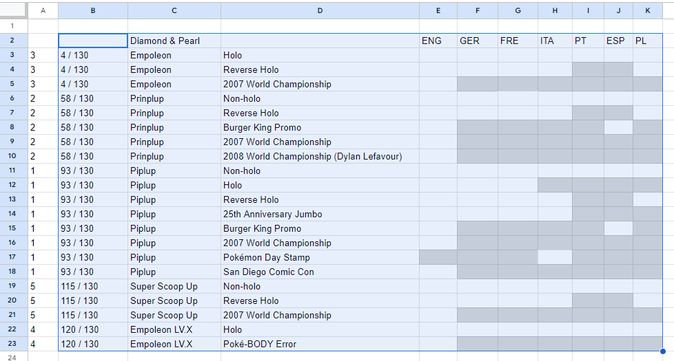
- Start by highlighting the section you want to make a border around by clicking and dragging your cursor over the desired section. We’ll do around the outside first, then the inside sections in a moment.
-
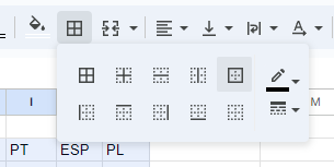
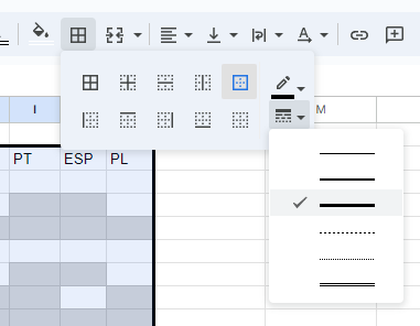
Then, click on the button in your top toolbar that looks like a box with lines in it. You’ll be shown the options below in a mini menu.
-
We want borders around everything that we highlighted, so we’ll click the corresponding button. In this case, that’s this one in the upper right.
-
To change the thickness of the borders, go over to this icon and select a new style.
-
You’ll need to reapply the borders by repeating the previous steps after selecting a different thickness if you want to change the ones that are already there.
-
For the outside, we want the thickest border available, so we’ll select the option above for now.
-
With the same selection highlighted, we’re also going to add borders between each column.
-
Reselect the thinner borders, then select the option for lines in between the cells (shown below).
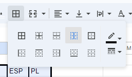
- We can also remove borders and change the thickness of different lines by highlighting a different area- just click the corresponding button!
Tips for Good Border Design
-
Use thick borders to surround the main sections. Just like this article is using a bigger font for the headings, you should use a thicker border to draw attention to the larger sections.
-
Thin borders are best for use inside the thicker borders. These create a contrast in visual weight, making the sheet easier to read.
-
Not everything has to be enclosed for it to be legible- sometimes less is more in this case, so feel free to experiment with what looks the best to you.
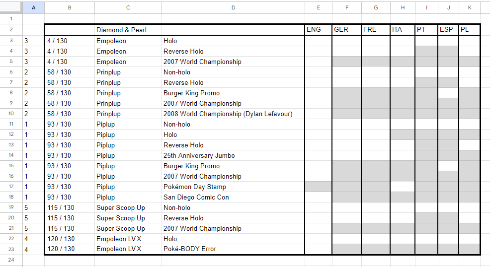
Border Examples
When finished with the borders, my personal sheet looks like this:
And the additional example is here as well:
This is already looking pretty good, but we can make it look even better!
Heading Colors
We’re going to add some color to the sheet to differentiate the main headings from the individual cards. I’m using blue here to match Piplup, but you can use whatever color(s) you’d like.
- Start by highlighting the cells you want to color.
- With the heading selected, click on the bucket icon, then select the color you’d like to use.
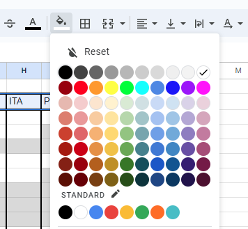
- I like using a darker color for the headings, and then lighter colors for the actual checkboxes, which we’ll get to later. A darker heading color will help it stand out from the rest of the card information.
-
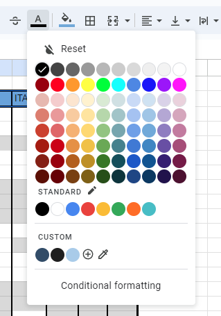
Because the text is a little hard to read here, we’ll change the color of the text as well.
-
With the cells still highlighted, we’re going to select the “A” to change the text color. I’m changing mine to white here.
Heading Color Examples
My personal sheet now looks like this:
And the second example looks like this now as well:
Much better! This is already shaping up to be an aesthetically pleasing sheet, while keeping everything easy-to-read at a glance! We still have some work to do before we start making everything functional, so let’s continue.
Typesetting
Once again, just like this guide, we want our sheet’s type to reflect the contents, so we’ll be adjusting that here as well.
Note: I prefer to keep the actual font standard (my default is set to Arial), but you can experiment with the font as well in this step!
-
Again, we’ll start by highlighting the text we want to change. We’ll start with the white headings.
-
Then, we’re going to bold the headings here by clicking the “B” button.
-
You can also increase the text size by changing the number to the left, which I’ll be doing to the illustration numbers on the side of this sheet, as well as the card version.

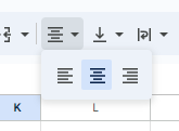
- While we have the text highlighted, we’ll also center the headings as well. Click the alignment button, then select the centered option.
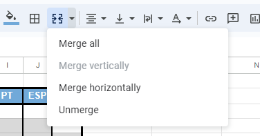
- You might notice that the set name here isn’t centered across all three cells. We can fix that by merging them.
-
To do so, simply highlight the cells you want to merge- in the image above, that’s B2-D2.
-
Then, click the “merge” button here to merge all.
Adding Padding
To make the cells that aren’t centered easier to read, and to move the type away from the cell line automatically, we’ll be adding something called padding.
- As always, we’ll start by highlighting our text.
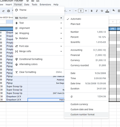
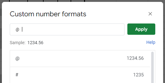
- Click on “Format,” “Number,” then “Custom Number Format.”
- In the next menu, type 3 spaces, then the “@” symbol, then 3 more spaces. It should look like the image below. Then hit “apply.”
- You can add any number of spaces you’d like with this method, but I’ve found 3 to be the ideal number for this font size.
Typesetting Examples
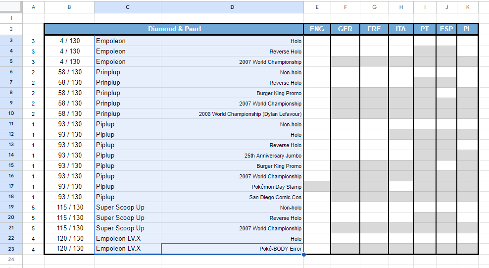
After bolding, altering the font size, alignment changes, and adding padding, my sheet now looks like this:
And the other example looks like this:
You’re doing great so far, so let’s make this sheet functional!
Auto-Formatting When you Check off a Card ✧˖°.
We want this sheet to automatically color the cells in that have been checked off, so to do that, we’ll use the “Conditional formatting” option.
Auto-Formatting Set Up
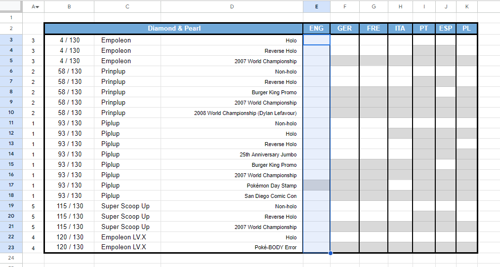
- Highlight the first column of the cells we’ll be using for the checkboxes. It doesn’t matter if you catch some of the grey cells in there too.
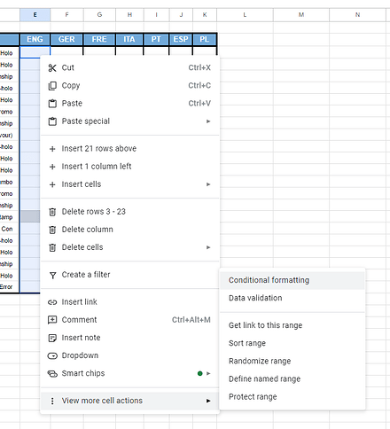
- Right click your selection, then under “View more cell actions,” select “Conditional Formatting.”
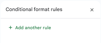
- A side menu will pop up. Here, select “Add another rule.”
-
The range here should already be preselected. Under “Format calls if,” select “Custom Formula is,” then type
=$E3="✔" -
“E” is the column you’re working in
-
“3” is the first row of that column
-
“
 ” is what you’ll be typing in the box to signify checking off a card. This can be anything, including full words, but I like the checkmark for my own sheets, so that’s what we’ll be using here.
 -
We’ll select a new color for a checked-off cell with the bucket tool right below “Formatting style”. I like the lighter blue for my Piplups to keep with the theme, but you can pick anything you want here.
-
I’m also going to make sure that the font is set to black. You can, again, make this whatever color you’d like- just make sure it shows up on the color you’ve picked.
-
Your menu should look like this, then hit “done”.
-
With this side menu up, we’re going to repeat the process for each column, adding another rule for each one, replacing the corresponding letters with the column we’re actively working in.
-
At this point, I’m also going to input all of the cards that I own by typing in whatever I’m using as a checkmark into the proper boxes- you’ll see that the color auto-updates for you now!
Auto-Formatting Examples
My personal sheet now looks like this:
And the other example looks like this:
Now you’re ready to copy this first section we’ve made and continue to fill in your data!
Important Note When FIlling in Data✧˖°.
Be sure your columns line up with each other! There should only be one language present in each column. This will be important for compiling your cover sheet as the next part in the guide.
Do:
Don’t:
Auto-Updating Cover Sheet ✧˖°.
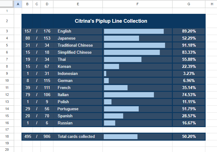
One of my favorite parts of my sheet is the auto-updating cover sheet that tells me exactly what percentage I’ve completed of my collection goals, along with a visualization of that progress in the form of a sparkline.
We’ve already been over how to format this sheet and make it look nice, so this section will only cover the coding to make it work.
Note: Don’t forget to make a new sheet in your file for the cover!
Automatic Number/Number Count
We’ll be using 3 columns for this count: one for the cards we have, one for the forward slash, and one for the total number of cards available.
Cards Collected
-
The formula for the first is super simple:
=COUNTIF('Sheet Name'!E:E,"✔") -
“Sheet Name” is whatever you’ve named the sheet you’re pulling the data from.
-
“E” in this case refers to the column that language is in. “E” refers to the data from my English column in the corresponding sheet.
-
“
 ” is whatever you’ve chosen to check off boxes.
 -
This is the formula for the English row of my personal sheet:
![]()
- Copy this formula for however many languages you’re collecting. Be sure to change the sheet name and column letter when applicable.
Total Cards
-
The total count requires a little more prep work. Before we begin on the formula, we’ll need to go in to each white box on our main sheet and type a “.” then color the text white.
-
Do not do this to the grey boxes or any boxes you’ve checked off. This will signify cards you still need to collect.
-
This process gets around the need for the Google Sheets extension to count blank boxes, which is why we’re doing it this way.

-
After you’ve done that, your formula for your cover sheet will look similar to the previous one:
=SUM(COUNTIF('Sheet Name'!E:E,"."),B3) -
“Sheet Name” is whatever you’ve named the sheet you’re pulling the data from.
-
“E” in this case refers to the column that language is in. “E” refers to the data from my English column in the corresponding sheet.
-
The “.” is what we just entered into all of those white boxes.
-
“B3” is the cell ID of your corresponding “Cards Collected” count in the same row. This will change as you move down the column for each language as well, so don’t forget it!
-
This is the formula for the English row of my personal sheet:
![]()
- Once again, copy this formula for however many languages you’re collecting, being sure to change to the correct information for each row.
Sparklines
The formula for the sparklines are also a fairly straightforward copy-paste:
=SPARKLINE(B3,{"charttype", "bar";"max",D3;"color1","#HEXCODE1";"color2","#HEXCODE2"})
-
“B3” is the cell ID of your corresponding “Cards Collected” count in the same row, just like above.
-
“D3” is the cell ID of the “Total Cards” count in the same row as your sparkline.
-
“#HEXCODE1” and “#HEXCODE2” are the 6-digit codes of the colors you want to use for your sparkline. The first is the fill color of the bar, and the second is the color of the blank space. You can find the hexcode of a color by simply googling “hexadecimal color picker” and copying the code from whatever you wish. You must use the “#” symbol in front of the code for the formula to work.
-
The formula for the English row of my personal sheet looks like this:
![]()
- Copy this formula for each language, changing the appropriate cells in the formula as you go.
Percentages
-
Use the formula
=Cards Collected Cell/Total Cards Cell -
Mine looks like this for English:
![]()
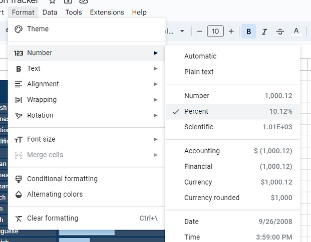
- Then, highlight the cell, click “Format” up at the top, “Number,” then “Percent.”
- Once again repeat for each language.
Total Count
If you’re like me, you’re going to want a total count of all cards in all languages and variants, so we’re going to combine all of the information above to make a final total.
Cards Collected
=SUM(B3:B16)
-
“B3” is the first cell in the column
-
“B16” is the last cell in the column, not including the cell this formula is in.
-
Your numbers might be a little different, depending on how many languages you’re collecting.
Total Cards
=SUM(D3:D16)
Same as above, just a different column than last time!
Sparkline
This is exactly the same as our previous sparklines- just copy-paste the same formula and change the cells like you had been doing.
Here’s that formula again just in case:
=SPARKLINE(B18,{"charttype", "bar";"max",D18;"color1","#HEXCODE1";"color2","#HEXCODE2"})
Percent
=Cards Collected Cell/Total Cards Cell
Once again, exactly the same as above. Don’t forget to change your format for this one like we did earlier as well.
And we’re done!
![]()
Final Notes ✧˖°.
Congratulations, you did it!
Seriously, thank you so much if you made it all the way through this guide. I know this was a ton of information, but I hope you’ve found it helpful in making your own collection tracker! If you have any questions about anything in this guide, feel free to reach out, and I’ll be more than happy to help as well.
If you made your own sheet with my guide, I’d love to justify my questionable use of the past few hours see your creativity and collections!
Happy collecting, everyone!
