Continuation of this thread, established due to rebranding of PWCC to Fanatics Collect
All my homies hate fanatics. RIP PWCC you will be missed
RIP PWCC

I just noticed the switch today. The website’s new theme triggers me but hopefully they’ll process things faster than PWCC did.
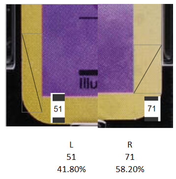
Centering looks off for a 10.
It’s technically still a ten because it is above the 40/60 for a 10
If you calculate using the pixels of the image it is roughly 42/58 ![]()
edit: I believe the grading standards are changing so won’t be a 10 after that.
Looks like the ability to check sold prices is broken with the new UI update. Also typing in the search box at the top of the page is extremely slow and delayed and ends up missing keystrokes when typing.
I can get to sold listings but it won’t let me search. You weren’t kidding about the search bar missing keystrokes. That is brutal right now.
They saw this and realized they needed to name change immediately.
Wait until I drop the Feenatics
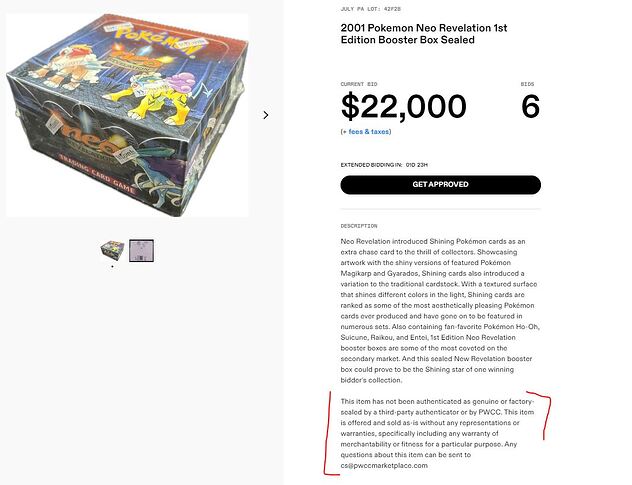
“Any questions about this item can be sent to cs@pwccmarketplace. com”
![]()

Within PSA 45/55 to 40/60 standards on their website.
Just saw that payment has to be received within 5 days of the weekly ending. I believe PWCC gave more time, like 2 weeks, right?
I just tried bidding on their app and I couldn’t just enter the number I wanted to pay, I had scroll for days and even the it would only go so high. Took me 3x of doing this to set a winning bid that was still way lower than what I actually wanted to bid. Maybe I’m just dumb, but if that’s actually how it works I’ll stick to the website, haha.
This is maybe the one positive so far
The grader liked how the swirl added to the eye appeal and gave it a 10 ![]()
![]()
Just did the update ![]() u hate to see it honestly. Kinda just feels like they made everything worse for no reason
u hate to see it honestly. Kinda just feels like they made everything worse for no reason
Loosing the yellow/black colour contrast makes the UI feel a bit messy. But it’s something that can be improved over time. Some of the font choice is also strange.

